Colours of the Incredibles
Pixar make some stunning movies. You could complain that their stories are pretty basic but from a visual standpoint, there’s no disputing their beauty.
One thing I love about these movies is the amount of effort that goes into choosing the colour palette for the movie. Yet, because of the speed of the action, this work barely even get noticed.
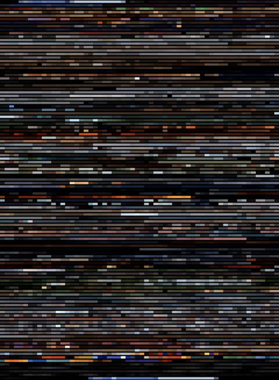
So what would it look like if we strip out the ‘image’ from these images, and leave only the colour information?
I used the Incredibles for this experiment because it’s my favourite Pixar movie so far. Incidentally, there’s an “Art of the Incredibles"-sized space on my bookshelf, in case anyone feels like filling it for me.
(click on image for higher-res version - 960 * 1308 px, 186.5KB)
# Jan 5, 2007Star Wars: Original Version vs Special Edition
I know it’s Star Wars, but… oh look, I just had to, okay?
With movies laid flat like this, it’s very easy to see how movies are structured. Much easier than actually watching them as movies. Now, this lead to a question: how are different versions of the same movie constructed? For example, how is Apocalypse Now structured compared to Apocalypse Now Redux? How does the American release of The Shining compare to the European version? Or, better still, just exactly how “shot for shot” was Gus Van Sant’s remake of Psycho?
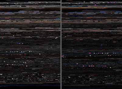
Let’s start on an easy one: Star Wars.
(click on image for higher-res version - 1940 * 1416 px, 1.1MB)
Strangely, for all his fucking about, Lucas has kept the structure remarkably intact. For most of the run-time, the two movies track each other pretty well, being only a few seconds out of sync. It’s not until the second half when they really start to diverge. But even still, the Special Edition is only a couple of minutes longer than the original version. Which is odd, because the Special Edition felt like it was a lot longer.
I also like the colours in the special edition. The faded pastel colours of the original are nice and all, but are definitely improved with a bit of spit and polish.
Not sure about the change of colour in the scene with Luke looking at the two suns though.
# Jan 5, 2007Koyaanisqatsi
When movies are torn apart and stitched back together like this, it lets you see the movie with a completely different perspective. Presenting them as one flat image, rather than a fast-moving sequence of images essentially allows one to, uh… ‘see through time’, so to speak. The editing is torn apart and the pacing of the movie is laid bare, for all to see.
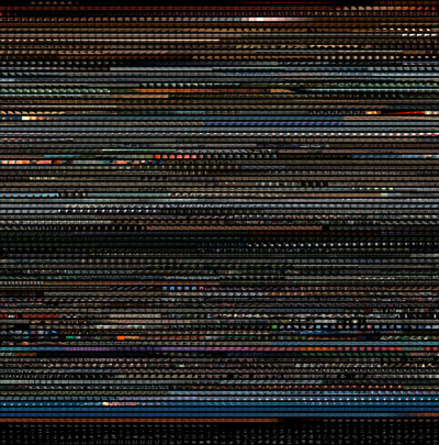
Koyaanisqatsi (an old favourite here at lowbrowculture) is a movie stripped to its fewest components. It is a movie that is all about the image and the editing. So that’s probably a pretty good place to start.
(click on image for higher-res version - 960 * 972 px, 416KB)
What I love about this movie and this set of images is just how perfect each shot is - each frame above could easily exist outside of the movie, like a perfectly-composed photograph.
# Jan 5, 2007

